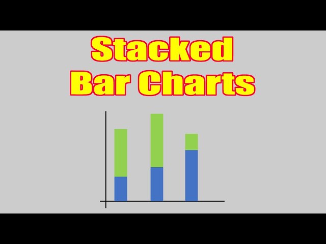
A stacked bar diagram is a powerful visual tool used to display data representing parts of a whole. This type of chart effectively compares multiple categories within a larger group, allowing for a quick and intuitive understanding of proportional relationships. Unlike a simple bar chart, a stacked bar diagram shows the contribution of each subcategory to the total value for each main category. This makes it ideal for showcasing complex datasets and highlighting the interplay between different variables. The visual representation facilitates easier comparison and interpretation of data, making it useful across various fields.
The stacked bar diagram’s strength lies in its ability to clearly present the composition of each category. Each bar represents a single main category, and the segments within that bar represent the different subcategories. The height of each segment corresponds to its value, and the total height of the bar represents the sum of all its subcategories. This approach allows viewers to quickly grasp both individual subcategory values and their relative contributions to the overall category total. Examining this detailed breakdown provides a comprehensive understanding of the datasets structure.
A stacked bar diagram is particularly useful when demonstrating changes over time for multiple components. For instance, visualizing market share changes across various product lines over a few years is easily presented with this approach. One can instantly see not only the overall market size change but also how the proportion of each product line altered during that period. This nuanced view supports informed decision-making and strategy development.
Understanding Stacked Bar Diagram Components
Creating effective stacked bar diagrams requires careful consideration of several factors. The selection of appropriate categories and subcategories is crucial for clear communication of the data. Data organization and scaling should be logically structured to ensure accurate interpretation. Inaccurate labeling or misrepresented scales can lead to misinterpretations; thus, precise labeling of axes and segments is essential. Consistent color-coding and clear legends further enhance visual clarity and avoid ambiguity.
Moreover, the overall design and presentation of the stacked bar diagram are vital for effective communication. Avoiding visual clutter is important; excessive details can overwhelm the viewer and obscure the main insights. A well-designed chart provides a concise and intuitive summary of the information, making it accessible to a broad audience. Remember, the goal is to reveal underlying patterns and relationships, not to confuse the audience with unnecessary complexity.
-
Define Categories and Subcategories:
Begin by identifying the main categories you wish to compare. Then, break down each category into meaningful subcategories. Ensure these categories are mutually exclusive and collectively exhaustive to avoid data inconsistencies. Clear definitions will prevent ambiguity and lead to a more accurate representation.
-
Gather and Organize Data:
Collect the relevant data for each subcategory within each main category. This data should be numerically organized for easy input into chart-creating software or tools. Accurate data entry is fundamental to the chart’s reliability and accuracy. Cross-check your data to ensure its consistency and correctness.
-
Choose a Charting Tool:
Many software packages and online tools allow for the creation of stacked bar diagrams. Spreadsheet programs, statistical software, and data visualization platforms offer a variety of options. Select a tool that aligns with your technical skills and the complexity of your data.
-
Create the Diagram:
Input your organized data into the chosen software. Configure the axes, labels, and legends according to best practices for data visualization. Choose colors that are visually distinct and easy to differentiate, supporting clear data interpretation and reducing visual confusion. Ensure the labels and titles are concise and unambiguous.
-
Review and Refine:
Once the chart is created, carefully review it for accuracy and clarity. Ensure the data is correctly represented, and the visual design supports easy comprehension. If needed, adjust the design elements or data labels to improve the presentation and communicate the information effectively.
Frequently Asked Questions about Stacked Bar Diagrams
Stacked bar diagrams are versatile tools, but several questions often arise regarding their use and interpretation. Understanding these common queries helps to optimize their implementation and ensure accurate data communication. The following frequently asked questions and answers provide guidance on various aspects of creating and understanding this powerful visualization tool, clarifying the nuances often encountered.
What are the advantages of using a stacked bar diagram over other chart types?
Stacked bar diagrams offer several advantages. They effectively display the composition of each main category, showing the contribution of individual subcategories. This detailed view is not readily apparent in simpler bar charts or pie charts, particularly when dealing with multiple categories. The direct comparison of subcategories within each main category is more intuitive than alternatives, simplifying data interpretation.
When should one avoid using a stacked bar diagram?
While versatile, stacked bar diagrams are not always the optimal choice. If the number of subcategories within each main category becomes excessive, the chart can become visually cluttered and difficult to interpret. If the total values of main categories are significantly different, it can be challenging to compare relative proportions accurately. In such cases, other visualization methods might be more appropriate, like grouped bar charts or other techniques better suited for data representation.
How can I ensure my stacked bar diagram is easy to understand?
Clarity is paramount. Use clear and concise labels for both axes and each segment of the bars. A legend is essential, especially if many subcategories are involved. Choose colors that are distinct and easy to distinguish. Avoid excessive use of shading or patterns, as these can complicate interpretation. Keep the overall design clean and uncluttered, focusing on effective communication of the data.
Key Aspects of Stacked Bar Diagrams
Effective use of stacked bar diagrams hinges on several key aspects. These aspects work together to ensure that the diagram is not only visually appealing but also communicates the data clearly and accurately. A well-constructed diagram will readily reveal patterns and trends, allowing for informed decision-making based on data analysis.
Data Accuracy
Accurate data is the foundation of any effective visualization. Errors in data collection or entry will lead to misinterpretations. Double-checking and verifying the data before creating the diagram is crucial. This ensures the diagram reflects the true state of the data and is not misleading.
Visual Clarity
The design should be clean and uncluttered. Avoid overly complex designs or excessive use of color that could detract from readability. A clear and simple design ensures that the information is easily understood, preventing misinterpretations.
Appropriate Scaling
Selecting the correct scale is important for accurate representation. An inappropriate scale can distort the perceived proportions of data and lead to misleading conclusions. The scale should be chosen to clearly show the differences in values while remaining easily readable.
Effective Labeling
Clear and concise labels for axes and segments are essential. Labels should accurately reflect the data being presented. Well-chosen labels contribute significantly to the overall clarity and prevent confusion.
These aspects, when carefully considered, ensure that a stacked bar diagram effectively conveys insights from complex datasets. The goal is always to enhance understanding, and careful attention to detail is critical for success.
Understanding the nuances of creating and interpreting these diagrams is key. It is often better to simplify your data groupings to avoid overwhelming the audience. Keeping the key message simple while showcasing the data effectively is what makes a well-constructed diagram.
Tips for Creating Effective Stacked Bar Diagrams
Creating effective stacked bar diagrams goes beyond simply inputting data; strategic choices optimize communication. The right approach enhances insights and leads to better interpretations. By carefully considering these tips, one can maximize the impact and clarity of the resulting diagram.
Remember, the primary goal is to clearly convey information, simplifying complex datasets into readily understandable visual representations. Attention to detail and strategic planning lead to effective communication.
-
Start with a clear objective:
Before creating the diagram, define the message you want to convey. What insights do you want to highlight? This clarity guides your data selection and visualization choices, focusing on the most important information.
-
Keep it concise:
Avoid overwhelming the viewer with too much information. Focus on a few key variables and insights. Overly complex diagrams can be confusing and ineffective. Simple, targeted visualizations are far more powerful.
-
Use appropriate color palettes:
Choose colors that are visually distinct and easy to differentiate. Avoid using too many colors, as this can make the chart difficult to read. Consult color palette guides for accessibility and clarity.
-
Add clear and concise labels:
All axes, categories, and subcategories should be clearly labeled. Use concise labels that are easy to understand. Precise labels prevent ambiguity and enhance interpretation.
-
Maintain a consistent scale:
Use a consistent scale across all bars. This allows for accurate comparison of values and prevents misinterpretations. Inconsistent scales can distort the relationship between the data and result in inaccurate perceptions.
Effective use of stacked bar diagrams requires careful planning and attention to detail. These visualizations are powerful tools for communicating complex information, providing a clear overview of data relationships that might be otherwise difficult to discern. Properly designed and interpreted diagrams will accurately reflect the relationships and trends in the data.
Choosing the appropriate chart type is vital for effective data communication. Stacked bar diagrams provide a unique perspective, allowing for insightful comparisons within and between data categories. However, understanding their strengths and limitations is critical for successful application. Careful consideration ensures that the visualization accurately and effectively conveys the intended message.
In conclusion, mastering the creation and interpretation of stacked bar diagrams empowers effective data visualization. By following best practices and paying attention to detail, one can harness their power to convey complex information clearly and concisely. The result is a more engaging and informative experience for the audience.
Youtube Video:

